Simple Account Set-up
I recently received my invite to Simple, a new banking service that has taken the design and development communities by storm with the promise of intelligently designed banking apps and interfaces. Now, I'm still waiting for my card to come, so I can't comment on the service itself. But, during the account set-up process, I was struck by how "right" it all felt, I took some screenshots as I went through to share.
Once you fill in your personal info and are approved for an account, you are taken to a page to set up a username and passphrase. Yes, you read that correctly, not a password, a passphrase. Simple claims a passphrase is easier to remember and improves the security of the account.
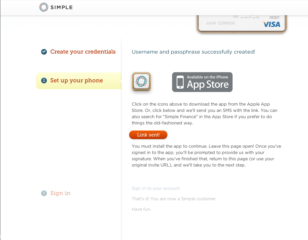
Once your passphrase and username are set up, Simple moves you to the next stage of the process, as pictured below: 
I elected to have a SMS sent to my iPhone to download the Simple app, sure enough in a few seconds there it was. I left the browser window open and proceeded to install the app which had me pick a 4 digit PIN as part of its setup.
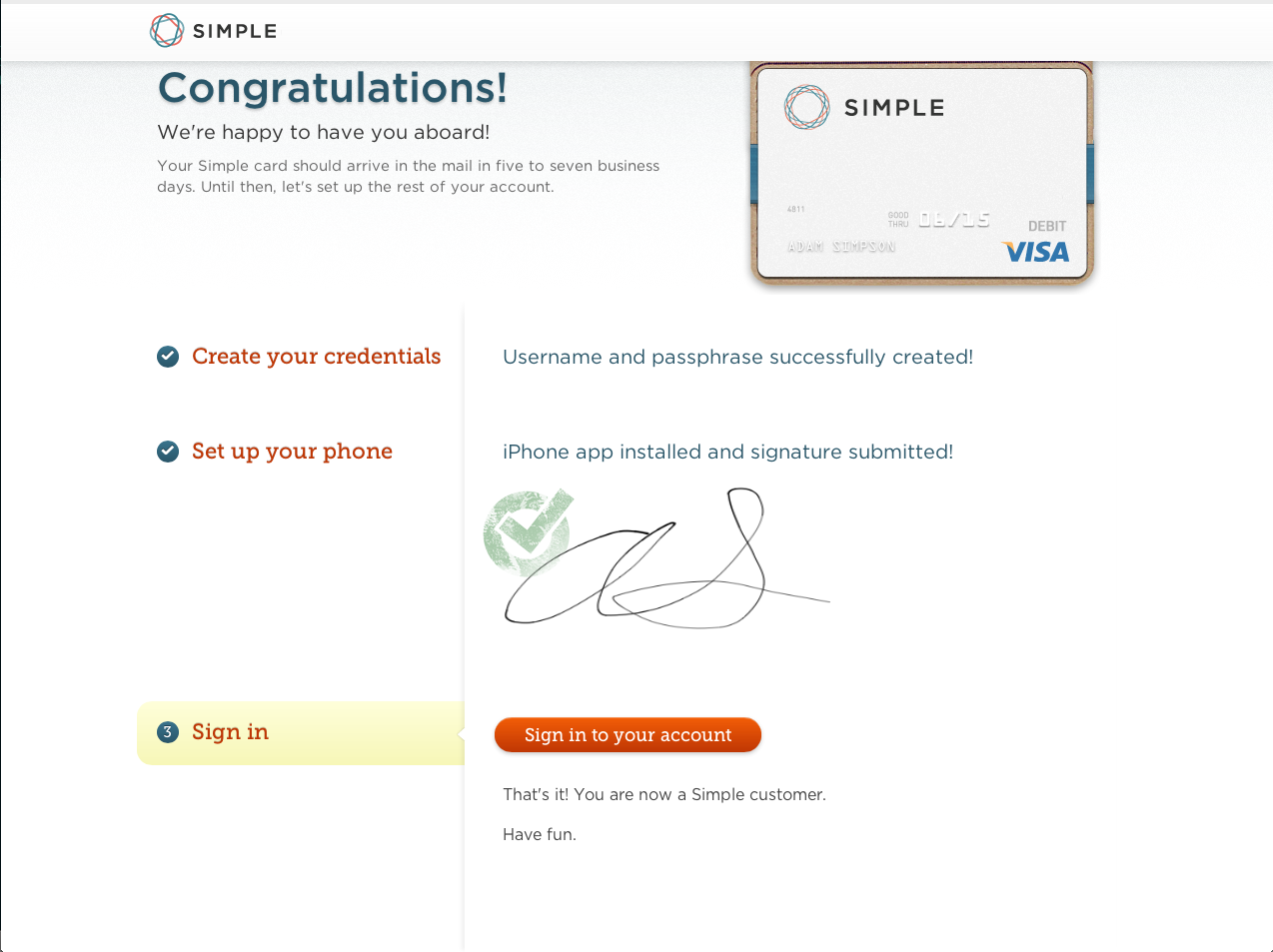
Once I selected my PIN, the app presented the various user agreements and banking terms with a signature box to sign with my finger. After signing the box and poking around the app a bit more, I looked up at my computer screen and saw that the Simple page had changed to this: 
Slick! The app had sent my signature to the page! In doing so, Simple infused a little bit of magic into a typically mundane sign-up process. The other key point of this process is that it ensures the focal point of the service, the Simple app, is set up and ready to go on every customer's phone.
I'm excited to get my Simple card and start using the service, I hope every other bank in the world is paying attention, these little details matter!